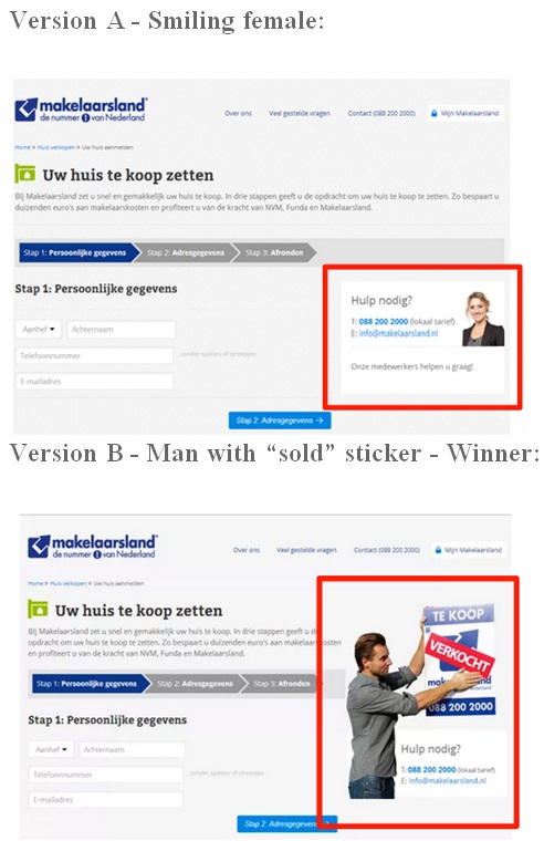
Makelaarsland is a Netherlands-based brokerage firm. Prospective home sellers can sign up on their website to make the company their estate agent. This case study shows how using a picture with a ‘sold’ sign increased signups by 89%.

Case study summary
• Brokerage firm looks to boost sign up form submissions
• Tested woman’s image against the photo of a man putting a ‘sold’ sticker on a ‘for sale’ sign
• Image of desired outcome increased signups by 89%
The challenge
Makelaarsand wanted to see if more people would sign up if a different image was used in the help section.
Prospective home sellers can register to post their home listings with Makelaarsand. The website had a three-step registration process for home listings — Personal Information > Address > Finish.
Towards the right, it had a ‘Need Help?’ section with the company phone number and email ID. Underneath, there was a photo of a woman employee.
The solution
Traffic Builders, an online marketing firm and a Visual Website Optimizer certified partner, ran an A/B test on Makelaarsland’s lead generation page with an objective to increase the number of home listings.
Traffic Builders tested the woman’s image against the photo of a man putting a ‘sold’ sticker on a ‘for sale’ sign.

The results
Changing the picture from a smiling female to a male placing a “sold” sticker on a “for sale” sign increased signups by 89%.
The test was run for 20 days at 95% statistical confidence before Makelaarsland implemented the changes on its website.
The second picture worked well because it showed prospective clients the desired outcome, driving the message “if you sign up with us, you will sell your home.”
According to Traffic Builders’ senior conversion optimization consultant Eva Louwen, the Variation image used a very specific persuasion technique — response efficacy. The psychological principlesubtly suggested how the action of signing up the form will ultimately result in the desired outcome of selling the house.
“People that sign up Makelaarsland as their estate agent want to be sure they’ll eventually sell their house. We used this technique by adding an image of a man putting a ‘sold’ sticker on a ‘for sale’ sign. This visual reassurance ended up convincing more visitors that signing Makelaarsland was indeed the right move to make,” said Eva, the author of the test.
“This technique was shown to me during Online Dialogue’s course on Master Of Online Persuasion. I picked it because it addressed the low response/trust issue problem with Makelaarsland,” Eva added.