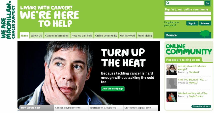
 Macmillan Cancer Support is a national cancer charity which provides practical, medical, emotional and financial support to people whose lives are affected by cancer. It also campaigns for better cancer care. The challenge they faced was that there was increasing traffic to their website and it was critical that users could find the information they needed quickly and easily. Webcredible suggested a new homepage displaying information on different cancer types, a redesigned contact us page, new information architecture for the online shop and brand centre, and a restructure of content within the site to better suit user needs.
The Macmillan Cancer Support website has seen a substantial increase in traffic to important areas for site users which had previously been difficult to locate. For example, there has been more than a 200% increase in people finding information on financial advice.
The user-centred design programme allowed Macmillan to get to know its target audiences and what information was of most interest to them.
www.webcredible.co.uk www.macmillan.org.uk
Macmillan gets online success
Macmillan Cancer Support is a national cancer charity which provides practical, medical, emotional and financial support to people whose lives are affected by cancer. It also campaigns for better cancer care.
Objectives
The challenge they faced was that there was increasing traffic to their website and it was critical that users could find the information they needed quickly and easily. The main objectives of the project were to:
- Understand user requirements
- Be able to respond to user needs
- Know who their users are
- Implement effective changes to the website
- Measure success
What we did
We carried out a user-centred design project, which involved:
- Usability testing on the main site to discover existing site problems
- In-depth research into the needs and requirements of website users
- Persona creation and development of content requirements
- Further validation of visitor numbers and user goals through an online survey
- Card sorting to identify user expectations of how the site's content was to be structured and labelled
We then worked closely with Macmillan to identify the key requirements for site users and recommend solutions accordingly. Macmillan implemented our recommendations, including:
- New homepage displaying information on different cancer types
- Redesigned contact us page
- New information architecture for the online shop, and brand centre
- Restructure of content within the site to better suit user needs
Results
The Macmillan Cancer Support website has seen a substantial increase in traffic to important areas for site users which had previously been difficult to locate. For example, there has been more than a 200% increase in people finding information on financial advice.
The user-centred design programme allowed Macmillan to get to know its target audiences and what information was of most interest to them.
“We now have a clear visibility of who our users are and what they want to get out of the website. As a result we can tailor content specifically to their needs and ensure that we and they get maximum value out of the Macmillan website.”
- Katie Smith, Head of New Media at Macmillan Cancer Support